Willó Organics is a brand of premium, eco-friendly skincare products, founded on values of simplicity, quality and sustainability. The aim was to create a luxurious yet natural visual identity that connects the product to its wholesome, countryside roots while highlighting its modern elegance. Willó Organics is a purely conceptual business developed as a portfolio piece, showcasing a cohesive branding collection of packaging, apparel, print and digital assets.
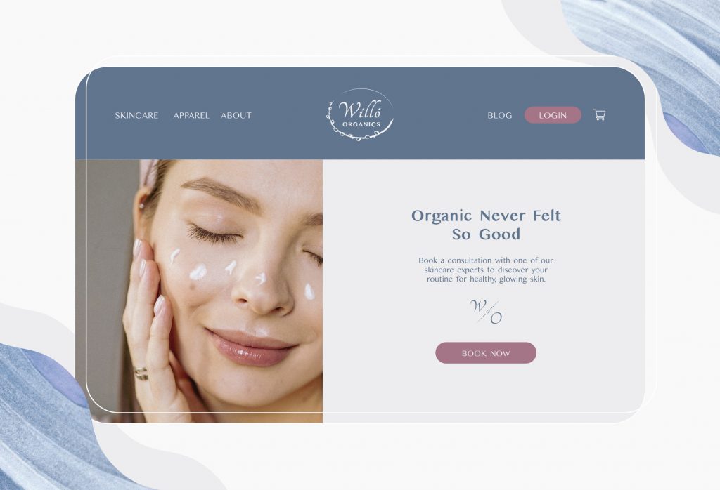
The challenge of this branding project was to design a line of skincare products and assets that would encapsulate both luxurious modernism and the earthy, organic qualities of nature. Using elements of plant iconography, minimalist typography, soft colours, and natural, fluid shapes, Willó Organics maintains a balance between rural simplicity and refined quality.
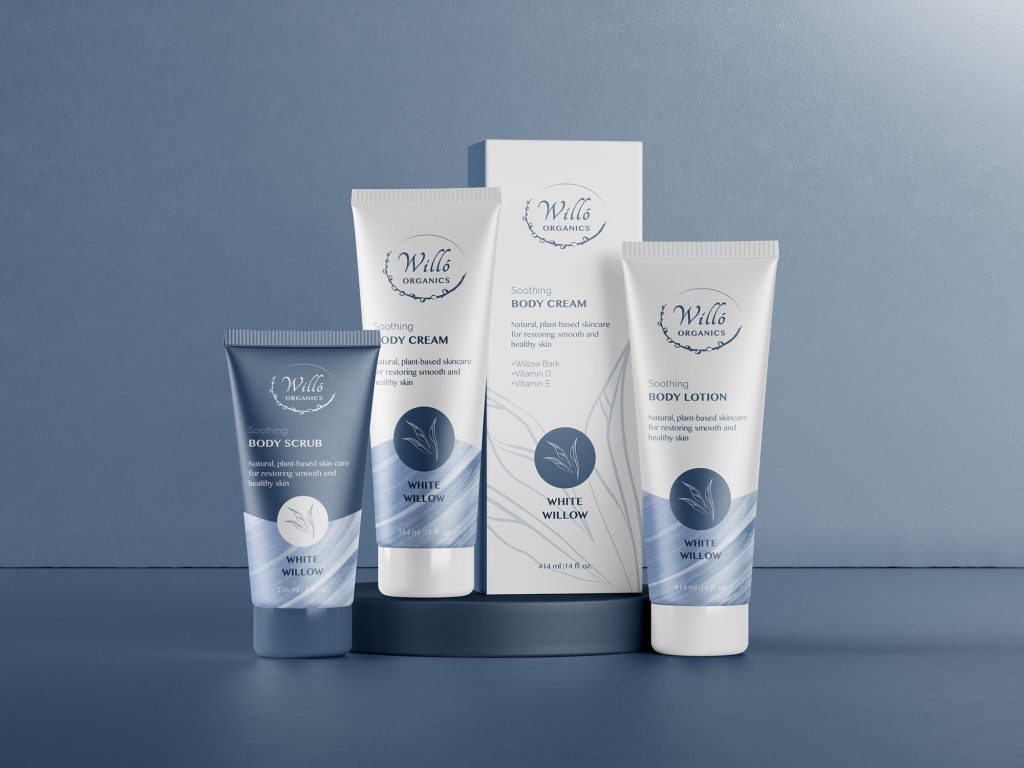
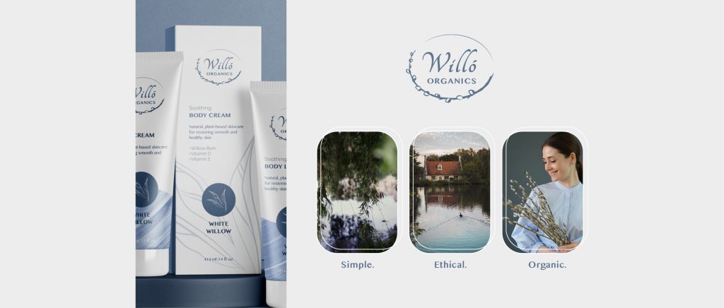
The main strategy of these packaging designs was to portray a down-to-earth luxury feel by integrating nature-inspired elements within a clean, sleek layout. The fluid motion of the textured graphic contrasted with crisp, curved lines gives the design an organic but modern look. Showcasing the design’s versatility across multiple variations with defined, consistent colours was also key. Mockups are from mockups-design.com
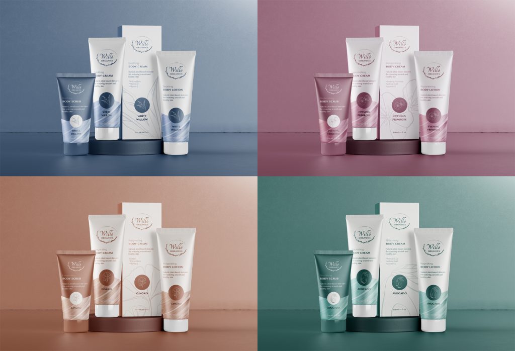
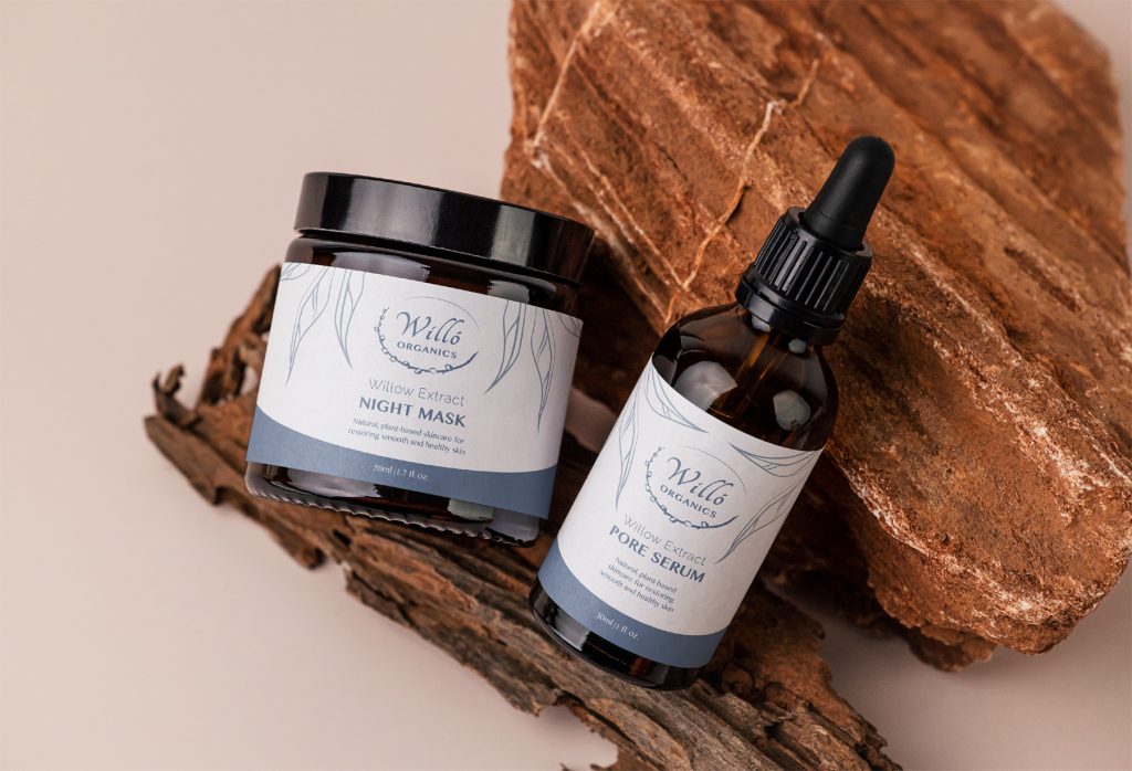
Willow bark extract has been used for centuries as a soothing agent for skin, and is a natural remedy for numerous maladies. The visual identity of this brand is inspired by the white willow trees of the English countryside, and the feeling of relaxation and contentment within nature.
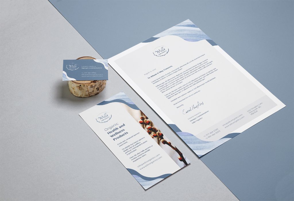
The natural movement and texture of the wave pattern was designed to evoke a sense of hydration and growth, water and environmentalism.
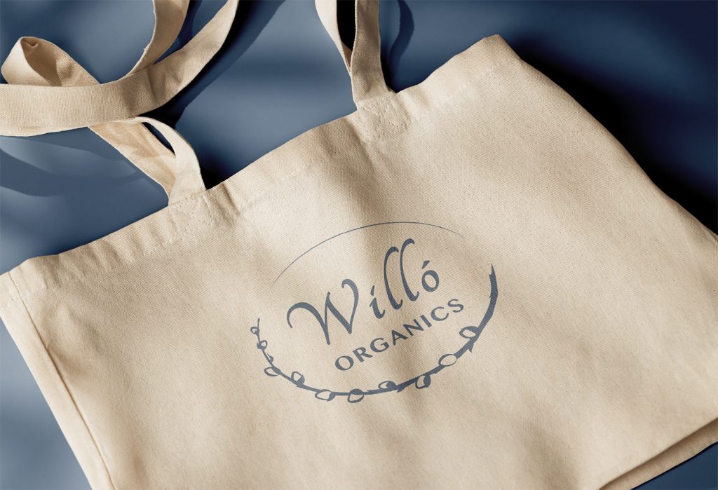
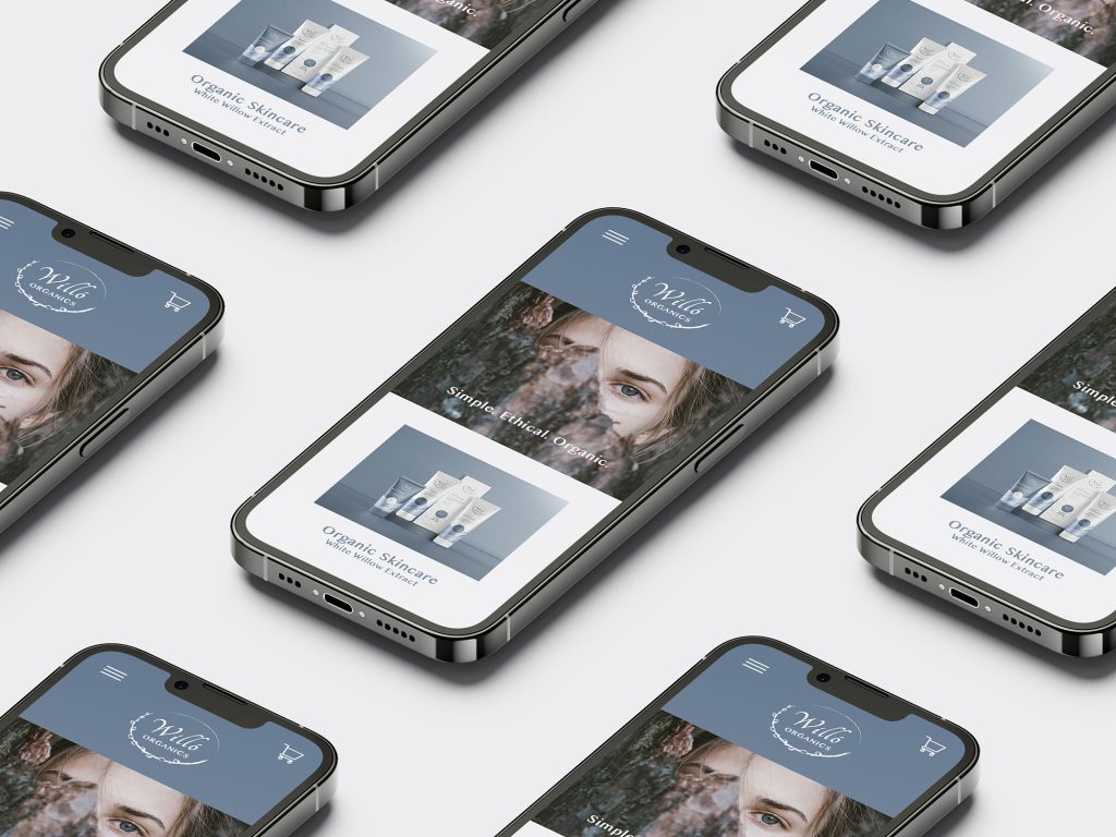
The versatility of Willó Organics allows the brand to look at home whether displayed in luxury boutiques, rural mom-and-pop shops, or in modern, digital spaces.
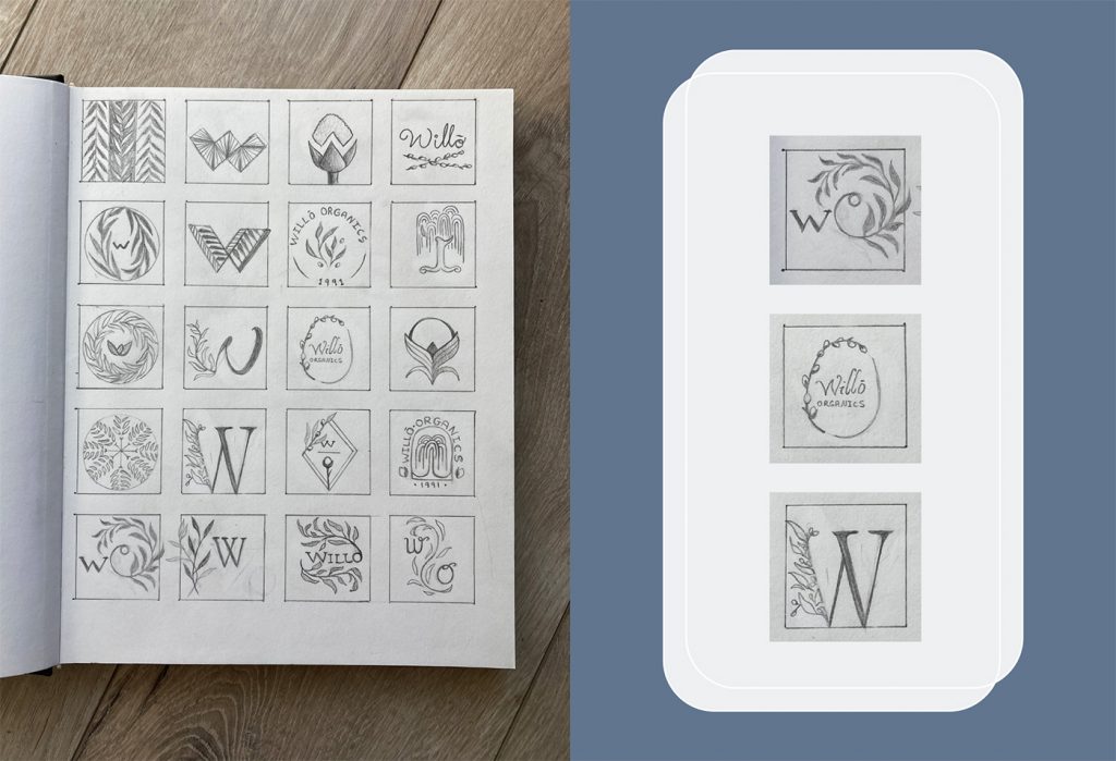
The initial exploration of the Willó Organics logo was centred around the natural shapes and curves of the willow tree, including the branches, pussy willow buds and the tree as a whole.
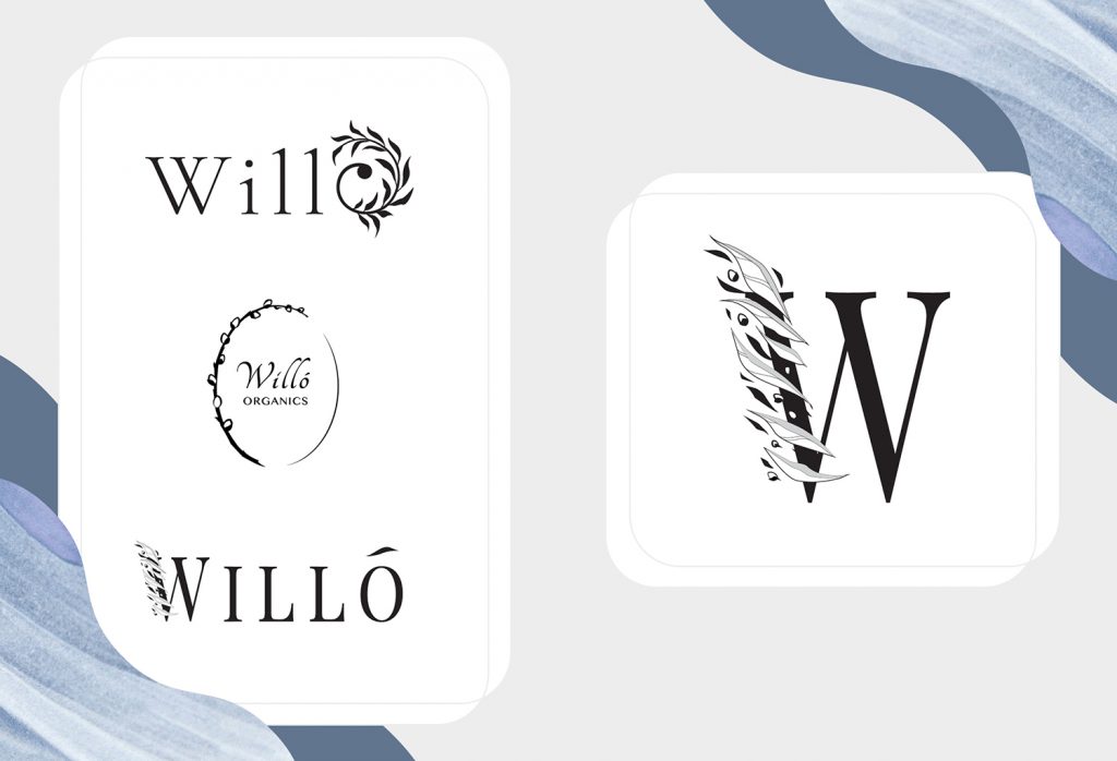
Between the three polished drafts, the middle pussy willow version was chosen for its cleanliness, cohesion and overall organic shape.
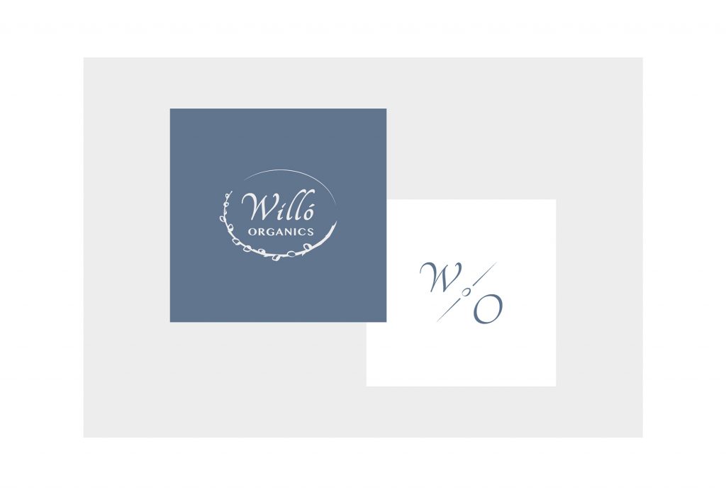
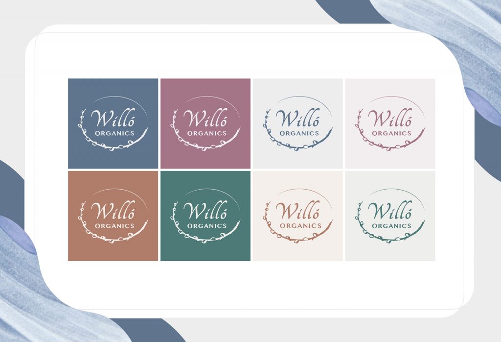
The final logo design was given a horizontal border to improve visibility and make maximum use of space.
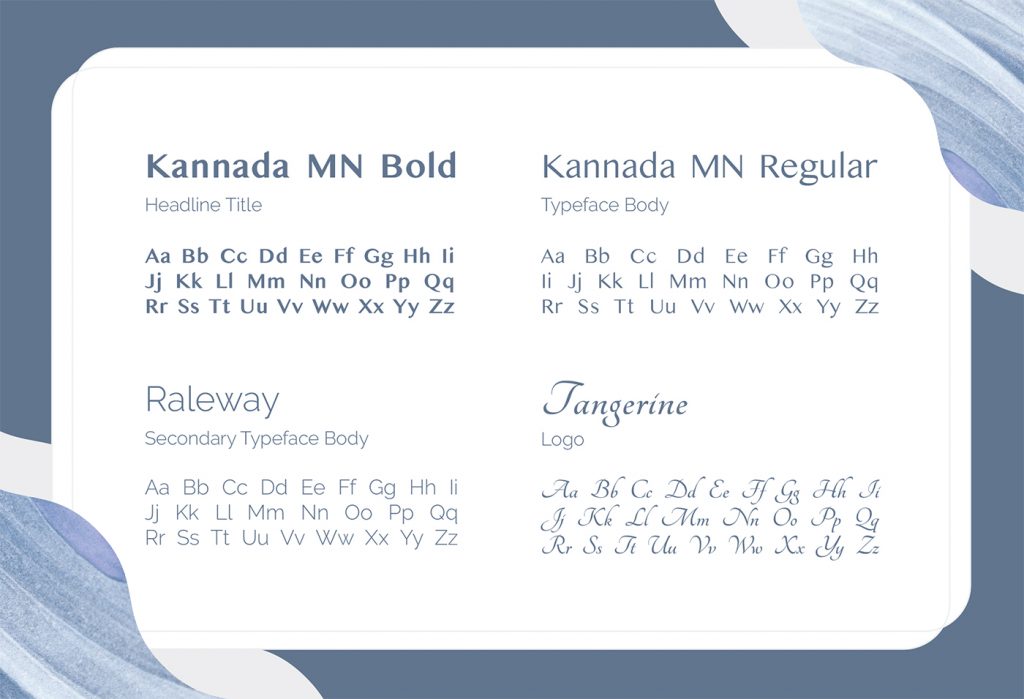
Kannada typeface was chosen for its professional simplicity, giving the brand a clean, luxurious look, while Tangerine contrasts with a flowing, organic movement, much like the sway of a willow branch.
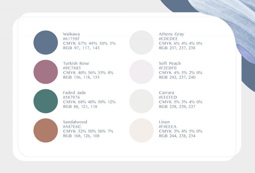
The use of soft, muted colours inspired by nature gives the brand a calm, soothing feel. The palette evokes a sense of natural balance through both warm and cool tones.
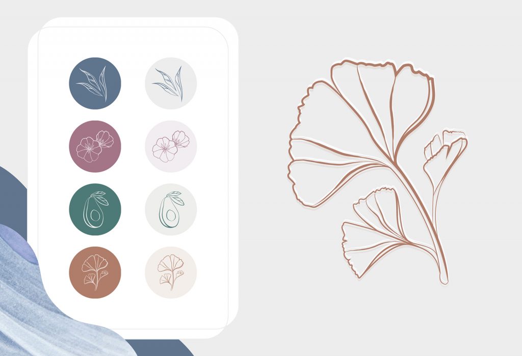
Plant centric iconography highlights the brand’s use of all-natural ingredients in their products, emphasizing Willó Organics’ promise to provide clean, organic skincare that puts the environment first.